The pursuit of beauty is an internal part of the human experience, influencing our choices in areas such as living spaces, fashion, art, print, design and psychology. Central to this quest is the role of color – a fundamental element that has captivated scientists, philosophers and creative professionals throughout history.
The psychological impact of color on our daily lives is undeniable, sparking the interest of designers, fashion artists, photographers, architects and other visionaries in their endeavors to shape our visual world, searching for beauty and aesthetics.
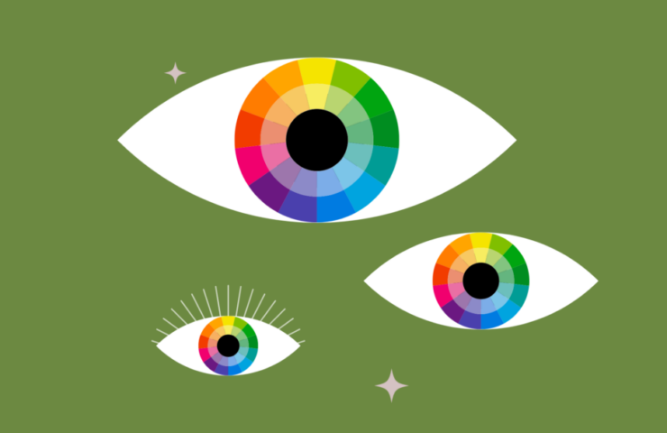
Color theory is a fundamental process in various creative fields, involving the combination of different colors to achieve harmonious and visually appealing arrangements. A key tool in this process is the color wheel, or color circle, which organizes colors based on their relationships with one another.
Artists, designers and filmmakers frequently employ color wheels to devise color schemes, drawing from both warm and cool colors to envision how they interact in diverse contexts.
The study of color dates back to ancient Greek philosophers, with the polymath Aristotle proposing an early theory of color. He postulated that all colors stemmed from the interplay of light and dark, connecting them to the four classical elements – water, air, earth and fire.
Aristotle’s theory remained accepted for more than two centuries until pioneering figures such as Isaac Newton and Leonardo da Vinci began to delve deeper into the nature of color.
In an experiment, Newton famously refracted white light through a prism, revealing its rainbow hues and subsequently arranging them in a circular form to create an early iteration of the color wheel. This groundbreaking work laid the foundation for the primary colors – red, yellow and blue – as we know them today.
In the wake of Newton’s contributions, numerous other scientists and artists – including Johann Wolfgang von Goethe, Jakob Christof Le Blon and Abbott Thayer – have since expanded upon and challenged traditional notions of color theory. Through their collective efforts, our understanding of color and its applications has evolved, granting us an ever-deepening appreciation for the complexity and beauty of this fundamental aspect of human perception.
Building upon the foundational work of early color theorists, the contemporary understanding of color harmony is structured around primary (red, yellow and blue), secondary (combinations of primary colors), and tertiary (combinations of primary and secondary colors) colors. These color relationships paved the way for various color schemes and models used across diverse artistic mediums.
In the realm of printing, for instance, the CMYK color model – representing cyan, magenta, yellow and key/black – is commonly practiced, leveraging the filtering of white light from the paper to generate a broad spectrum of color combinations.
Similarly, color theory plays a significant role in fields such as fashion and interior design.
Fashion designers frequently utilize five primary color techniques – monochrome, contrast, soft combinations, neutral and a mix of neutral and complementary colors – to create visually appealing combinations.
Monochromatic outfits rely on a single color, often black, though contrasting shades or bright colors can also be incorporated. Contrasting color combinations balance a standout main color with a neutralizing accent color, while soft color combinations blend gray or pastel tones like burnt orange, burgundy, plum and sage. Neutral combinations encompass shades of white, beige, camel, gray, brown and black, following the key rule of pairing cold neutral shades with other cool tones.
Color theory is equally crucial in interior design, with designers drawing on color combinations to create monochromatic, analogous, triadic, complementary and tetradic color schemes.
The chosen color palette can significantly impact a space’s ambiance; for example, blue-dominated spaces evoke serenity, leisure, peace and calm, even potentially reducing blood pressure and anxiety. Similarly, green spaces exude a youthful and relaxing vibe, while white can create a sense of spaciousness, modernity and tranquility. On the other hand, yellow and red – both energetic colors – may also trigger negative feelings or irritation in a room’s design.
Today, the application of color theory appeals to diverse disciplines, enriching our appreciation of the natural world, shaping our emotional experiences and continuing to inspire further inquiry into the complex interplay between color, perception and the human experience.


Recent Comments